What color is sunlight?
The majority of people—99%, in a casual estimate from Charles Foster, Senior Director at Lightswitch in fact—would say yellow. We draw it, unfailingly, as big yellow circles in the skies of our sketches. Even first-year lighting design students do the same, using yellow gels on stage lights when they’re told to create a sunny scene.
But sunlight isn’t yellow. It’s a cool, vivid white. Somehow, our perception of something as ubiquitous as sunlight doesn’t match reality. For lighting designers like Foster, lighting design education starts here: unlearning everything you thought you knew about light.
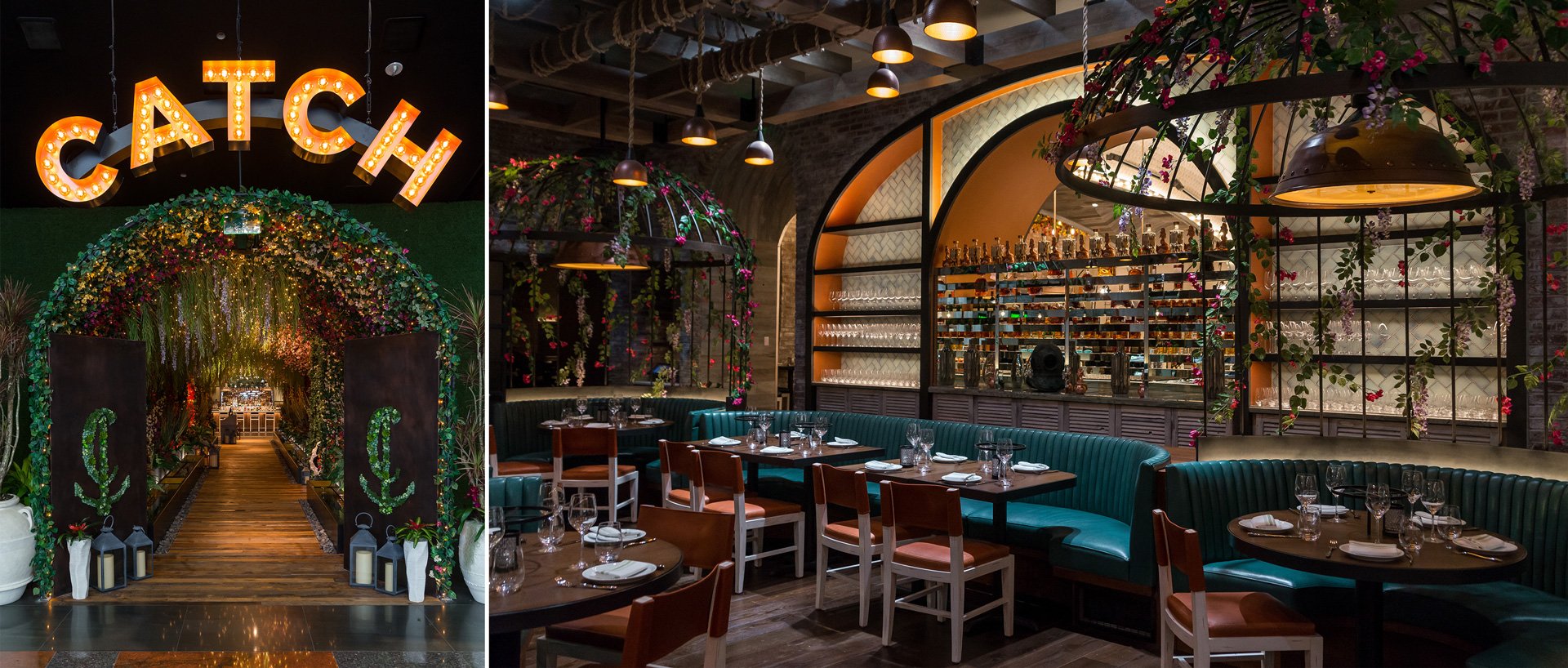
We sat down with Foster to talk about all things light, color, and perception throughout his lighting design career—including his recent work at CATCH, the star-studded, Instagram-worthy restaurant at the Las Vegas’ Aria Resort.
To start off, can you tell us a little bit about yourself and your design philosophy?
I got into lighting design about 20 years ago. I started with a theatrical background, working on and off Broadway in New York. Somewhere along the line I transitioned away from theatre towards themed hospitality and architecture. My general philosophy is that all that matters to any given project is how successful it is. Of course, this varies by project. If it’s a live event, success may be about providing a spectacle, or creating an engaging story. If it’s a more permanent installation like a restaurant, it’s about the comfort of the guests, how well the space works together, and ultimately, how profitable that business is.
How do you approach a design project? Are there any recurring principles you can share?
On any project, dollars per square foot is a major concern. That said, we try to remind ourselves to always think about it as memories per square foot. People have so many choices for how to use their time, so it's up to designers to create truly exceptional experiences that are worth leaving the house for. Of course, there’s no formula for what makes a restaurant comfortable or welcoming, but our goal is always to balance the practical concerns of owners, interior designers, and end-users to create something special.
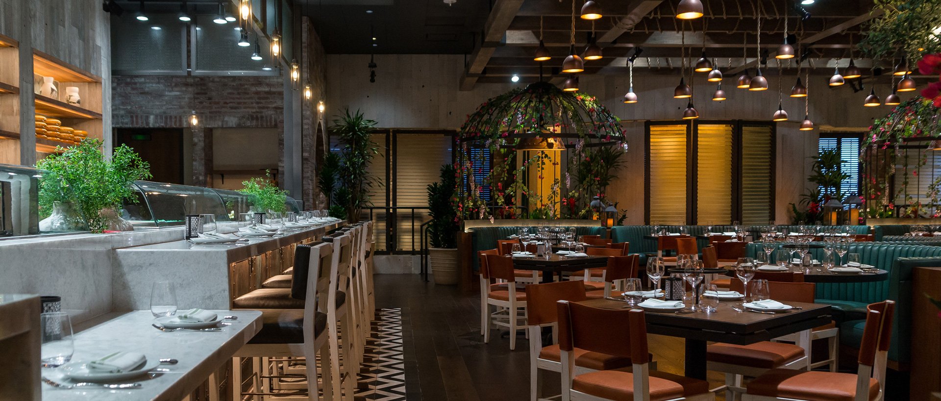
Simplicity is another principle of ours. At CATCH, a lot of ideas were presented—good ideas—but it was often the simplest ones that made it all the way. Just because you have a color-changing fixture doesn’t mean you have to use every color in it. I never want to draw attention to the lighting unless it’s an installation about the lighting. For a restaurant project, you don’t even want people to notice the light—and in many cases, they don’t want to see it either. They just want to feel a space is right without seeing the technology of why.
That’s an interesting concept, when light should be seen and when it should be invisible. With CATCH specifically, it seems like it’s a see-and-be-seen restaurant, with Instagram-worthy moments. Can you tell us how you approached creating that balance—a comfortable dining experience that still sparks visual interest?
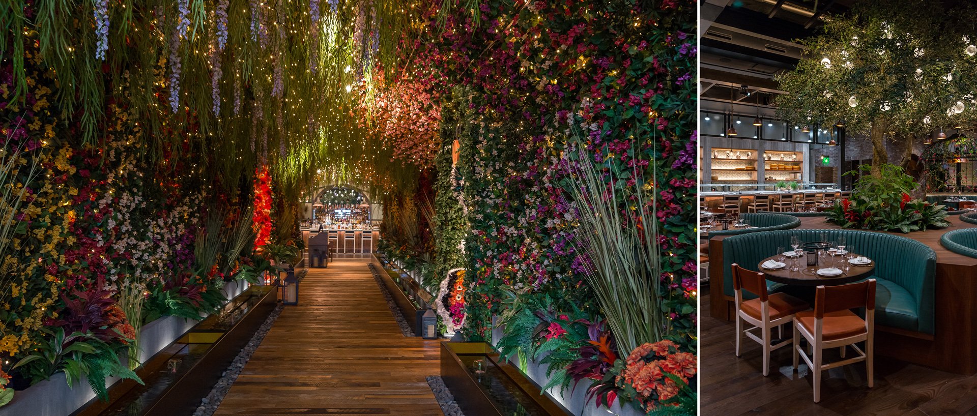
CATCH was definitely conceived of as a restaurant that people would want to take photographs in, and that was part of the design mandate. The fairy light-covered entry archway is intended to be a dynamic place to take photos. But that always poses a challenge, because photography lighting oftentimes doesn’t look great in person, and vice versa. Designers love contrast, and cameras don’t.
Of course, the solution isn’t to create a space where everything is at a similar level of intensity—that’s the last thing we want. The goal is a visually compelling space where you see one architectural detail, and then another, and then another, all building up into one great experience—and that’s never going to happen if a space is flat. Even though CATCH is a space with visible lights, there are also hidden features. Sometimes creating that balance is a case of “Focus on what I’m doing with my right hand and not my left.”
On any project, dollars per square foot is a major concern. That said, we try to remind ourselves to always think about it as memories per square foot.
Can you share a specific example of how you struck that balance?
Well, in addition to the fairy lights, there are Ketra spot heads tucked in among the foliage in the entryway. They’re relatively hidden, but they’re pretty important players in creating the overall light level in the space. There are some prominent decorative fixtures in the dining room that seem like the main light source, but above them are tracks with Ketra fixtures spotting individual tables and lighting the tree in the center of the space. It shows you how sometimes the fixtures that seem like they’re creating the light in a space aren't actually the ones doing it, and that’s because we want to strike that balance of comfort and visual impact.
As a lighting designer, you always need to be prepared to pivot. That was one of the reasons we pushed for color-tunable fixtures—so that it could be balanced on site. Showing someone a spec sheet that says a source is a warm white when it doesn’t feel like a warm white in the space doesn’t add any value. By choosing a tunable solution like Ketra, we can finetune the color on site, and that’s really valuable.
We partnered with the Careers Through Culinary Arts Program (C-CAP) to illuminate their benefit back in February 2020. We gave all the chefs control of their individual Ketra-lit stations, and we noticed that chefs who were serving fish often chose cooler white color temperatures. I know CATCH serves a lot of seafood, were there any considerations like that in the design?
Definitely. The decorative pendants in the dining area of CATCH have very warm, copper-toned reflectors in them. And even though the sources in those lamps were around 2700k, the effect was much, much warmer than that. When you’re planning a project like this six months or a year ahead of time, you don’t necessarily know what those final finishes are going to be. But that one unforeseeable design element shifted the perception of the entire space. It’s pretty well documented that as people adjust to the space, the warmest white is what becomes white to them—and their perspective changes accordingly.
So people come into CATCH, and even though it's a super warm space (around 2200k or 2300k) if they see something that’s 2700k or 3000k, it suddenly seems very cold by contrast. As a lighting designer, you always need to be prepared to pivot. That was one of the reasons we pushed for color-tunable fixtures—so that it could be balanced on site. Showing someone a spec sheet that says a source is a warm white when it doesn’t feel like a warm white in the space doesn’t add any value. By choosing a tunable solution like Ketra, we can finetune the color on site, and that’s really valuable.
CATCH is inside the Aria Resort and Casino in Vegas—Were there any challenges to designing in that casino environment, where you’re going between vastly different environments—from brightly lit spaces and corridors to dark clubs?
We actually accounted for that with the long entryway serving as a “tunnel of transition” from the brighter white light of the lobby space to the warmer restaurant space. It became a part of the overall experience, giving a little bit of breath between the public lobby and the CATCH bar.
Very Alice in Wonderland, almost. You’re going through this tunnel into a place ensconced in a different light level than what you’re used to.
Right, and it also provides a visual reset. That’s the whole purpose for the blackout at the beginning of a play—to let everyone exhale, take a moment, and let their eyes reset to darkness. This way, when the lights come up on stage, they’re perceived as bright and vibrant regardless of the house lighting in the theatre five minutes prior. The transition corridor has that function at CATCH, where it lets you reset your visual expectations for an entirely different type of space.
Once diners have made it through the tunnel, what are you hoping they’ll find? How do you want people to feel in the space?
Of course I hope they have a moment where they think it’s a beautiful space, but in the end, their memory of the night will be much more than the architecture of the space itself. It’s forever tied to what they thought of the food, who they were with, and what they were celebrating. Our goal is to make the overall experience truly something special. This is Vegas, pulling you out of the mundane is part of what you’re paying for.
That’s really what Vegas is for, right? You break out from your nine to five box into this make-believe world of light and color and vice.
Absolutely, Vegas has all of that multiplied exponentially. Designing in Vegas is always both a challenge and a thrill because you’re creating spaces for people who aren’t just escaping the mundane, they’re expecting the spectacular—or at least they’re hoping for it.
When it comes to creating extraordinary, memorable experiences like those at CATCH, the work of lighting designers play a greater role than many of us may realize. Ultimately, the lesson we gleaned from Foster was brilliantly clear: our perception of light is based on our relative lighting experiences, not the absolute value of a hue. How we perceive light and color change in context, and the role that designers play in creating that context—in shaping our perceptions and subsequently our experiences—can be something many of us overlook. That is, until we’re given a chance to look more closely.
To learn more about the creation of CATCH Las Vegas from the lighting designers themselves, head over to Lightswitch for a closer look.